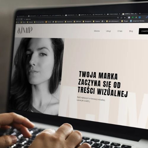
But we suggest spending a little more time working on some aspects when creating your online business card. The page should be no less attractive than your working profile. The success of your sales depends on how well it is designed.
How to structure the page?
A chaotic design of business cards is one of the biggest mistakes when working with this tool. Even if we imagine that such a page will look attractive, there is a risk that the client may get confused about what is indicated on it and not take the important target action.
We suggest using a standard working scheme:
- First block: Your avatar and a caption with your name or brand name.
- Second block: Text where you briefly but vividly tell customers about yourself. What do you do? What makes you different from your competitors? You can indicate your unique selling proposition.
- Third block: Catalog of goods and services. You can list them as text, but it’s more effective to add images of a specific product with a text description. Remember that it’s very important to build customer trust in this part of your page. This is where you can add reviews, certificates, or something like that, if available.
- Action block: Here you can add order buttons, application forms – anything that encourages the client to take action. If you have several products/services, you can alternate contact blocks directly with blocks describing the product. Also, in this place, leave contacts and links to your social networks for communication.
- In principle, you can end with a contact block, but if you wish, you can leave a pleasant wish for the client, your brand’s motto, or any other message that you think will logically complete the client’s acquaintance with you through the multilink.
Having dealt with the page structure, pay attention to the points described below.
Page background.
The first thing to pay attention to is the background itself and its color. We do not recommend using images overloaded with details: it does not look stylish, and there is a possibility that some of the information will be impossible to read.
Choose a background depending on what you are offering. It’s strange to advertise services for children on a black background. It’s better to choose neutral colors that are relevant at the moment. The background should contrast with what will be placed on it. The ideal option is white. But to make the page look more interesting, choose any of the pastel colors. If your direction allows, you can use bold options: black, bright colors. Don’t overdo it. The presence of a brand book with the specified colors greatly simplifies the choice of background.
Most services for creating multilinks offer to reduce the time spent searching for a suitable background and use the built-in themes and templates for pages.
For example, the Hipolink.net service offers 34 templates sorted by categories of selling accounts. To evaluate the functionality of the service, you can register for free at Hipolink.net or use the following promo codes:
- instaplus – 14 days of free use of the maximum tariff
- instaplus14 – 20% discount on any tariff and period
Design of text blocks.
The main rule is to write correctly and simply. Choose a linear sequential narrative structure, the visitor should not forget what was before. Don’t write too much. Make sure that a single writing style is maintained: address in the same number, verb tenses.
The font size is large. Mark headings with a different size and font weight. You need to highlight the important, not the entire text block, only then it will make sense. Make lists, add sub-items to make the text easier to read.
The text color should be contrasting and readable. A win-win option: light background – dark text. Also, pay attention to the text on the buttons of websites, social networks, messengers.
The simpler, the better.
The task of micro landing pages is to bring the visitor to the action you need. To do this, he a) must not forget why he came; b) must not get lost in the abundance of information and leave because of this, never completing the plan. Therefore, the design of your page should be made as simple as possible. Reduce all navigation, highlight the buttons on which the action is performed. Minimize the number of blocks. Replace excess text with images.
A little about images.
The avatar, photos, and all images must be of high quality. In addition to the fact that it looks nice and neat, it will also show that you respect your potential client. And, probably most importantly, the consumer must understand everything that you convey to him. Choose a single style for photos that will harmoniously match the overall style of your page.
A separate page for each direction.
Do not place information about all areas of your employment on one page. Especially if they are radically different. In addition to the fact that such a solution will preserve the necessary simplicity of your business card, there is another plus. Several pages – a higher probability that more random visitors will see information about you and you will have more customers. You can specify links to others on each of the pages to redirect user flows.


